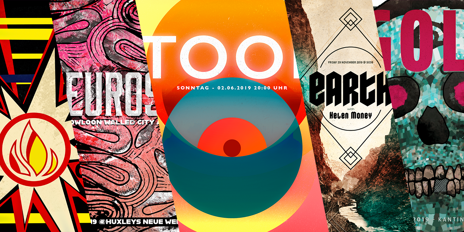
All the Posters from the concerts I've been in 2019
When I moved to Berlin, back in 2012, I came up with a project to design a poster for every concert that I would go to. In the first year, things worked all really well but, due to a lack of time, I stopped doing those in 2015. I missed doing it, but I didn't feel like doing them. It's a weird feeling to have, but... it happens.
At the beginning of 2019, I decided to try harder and not waste the opportunity to design something for each concert. It took me a while longer than expected, but, in May 2020, I managed to create the last one.
Here there are posters in different styles, from illustrations to my own photography. There is even one that exists as a tribute to classical design. They were all done in a mixture of techniques as the band that they portray.
Below you can see the 23 posters I designed for the concerts I went to in 2019.
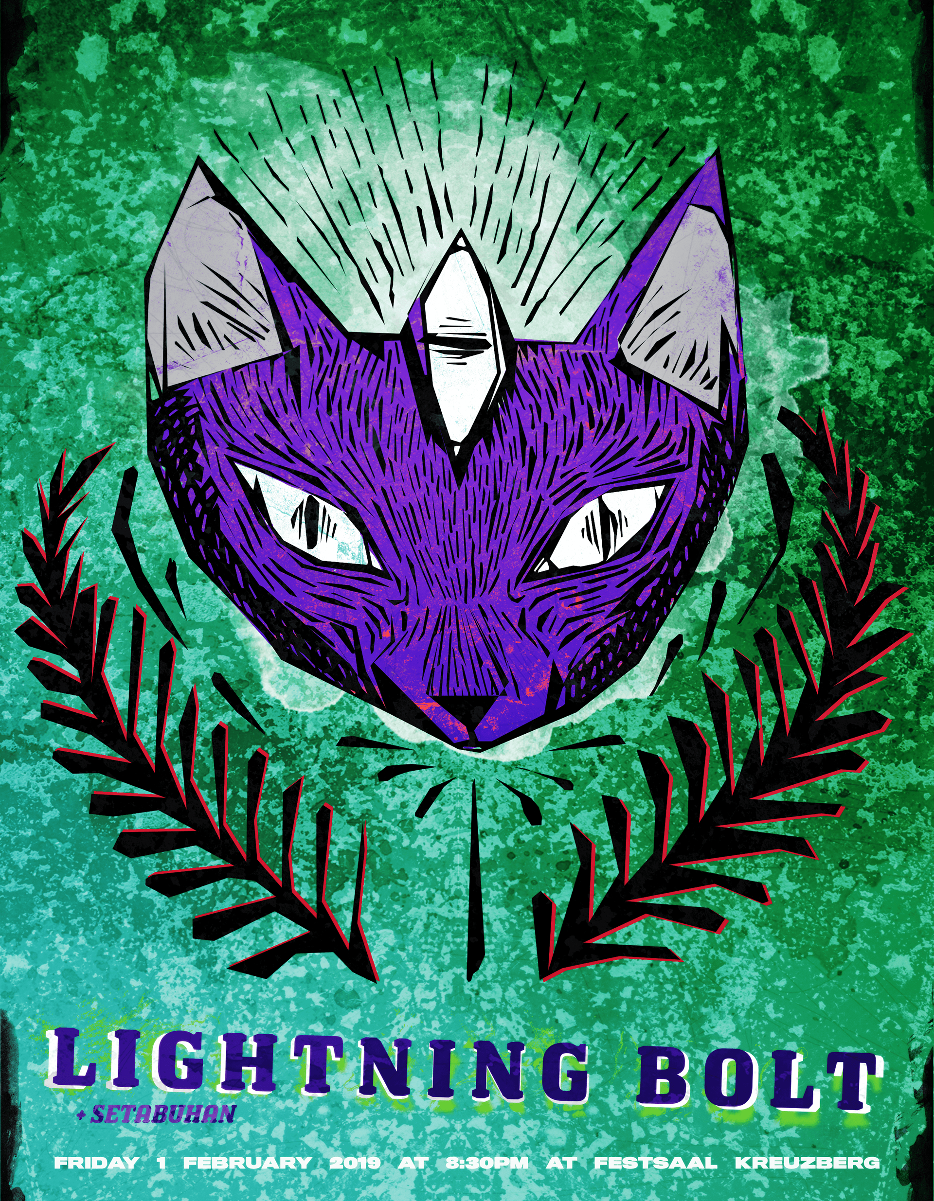
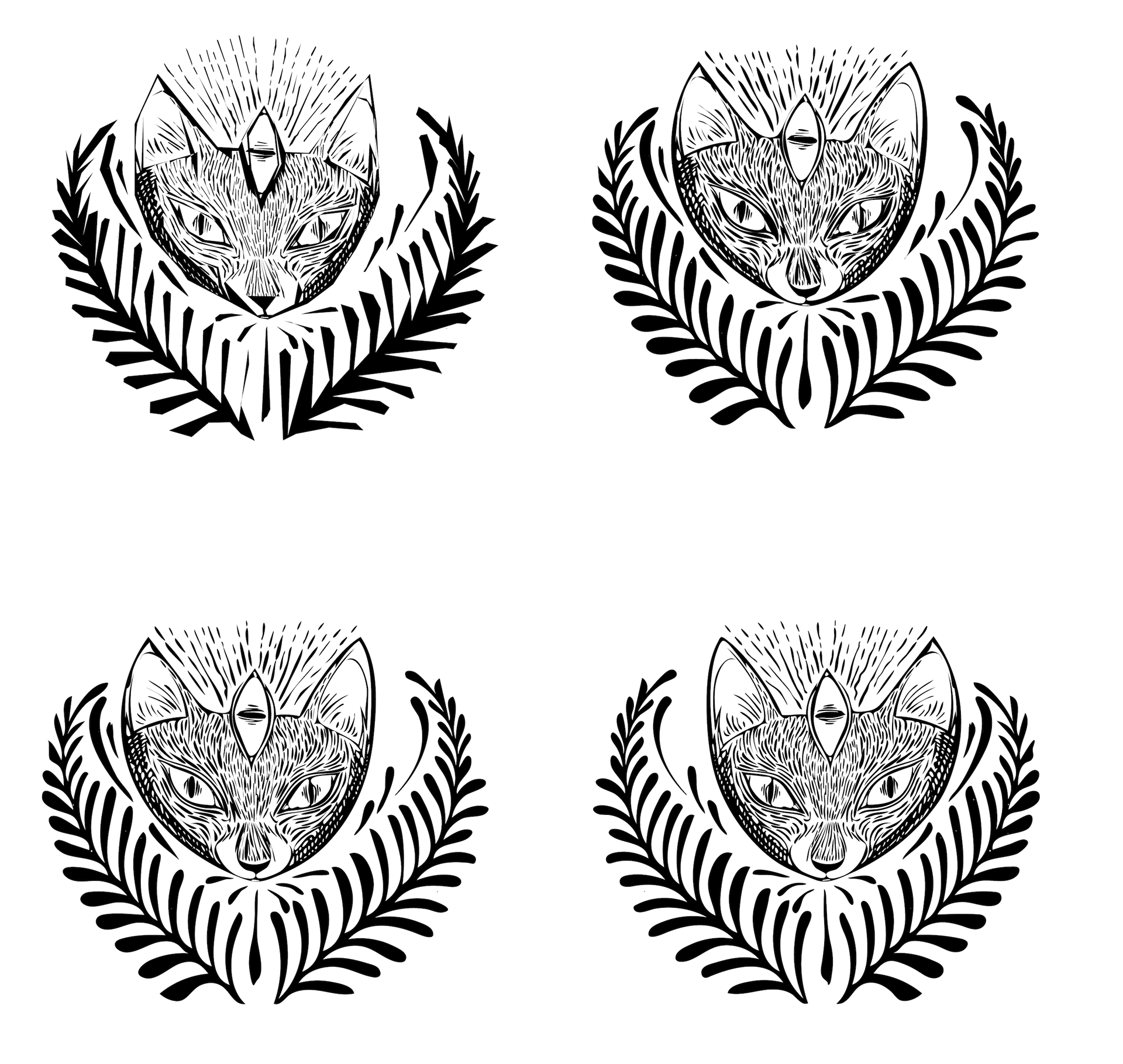
My idea here was to play around with colors that I don't often use and pick up the main illustration element from a project that failed on me a couple of months ago. This cat drawing was rejected for something else, but it will live on this poster for Lightning Bolt.
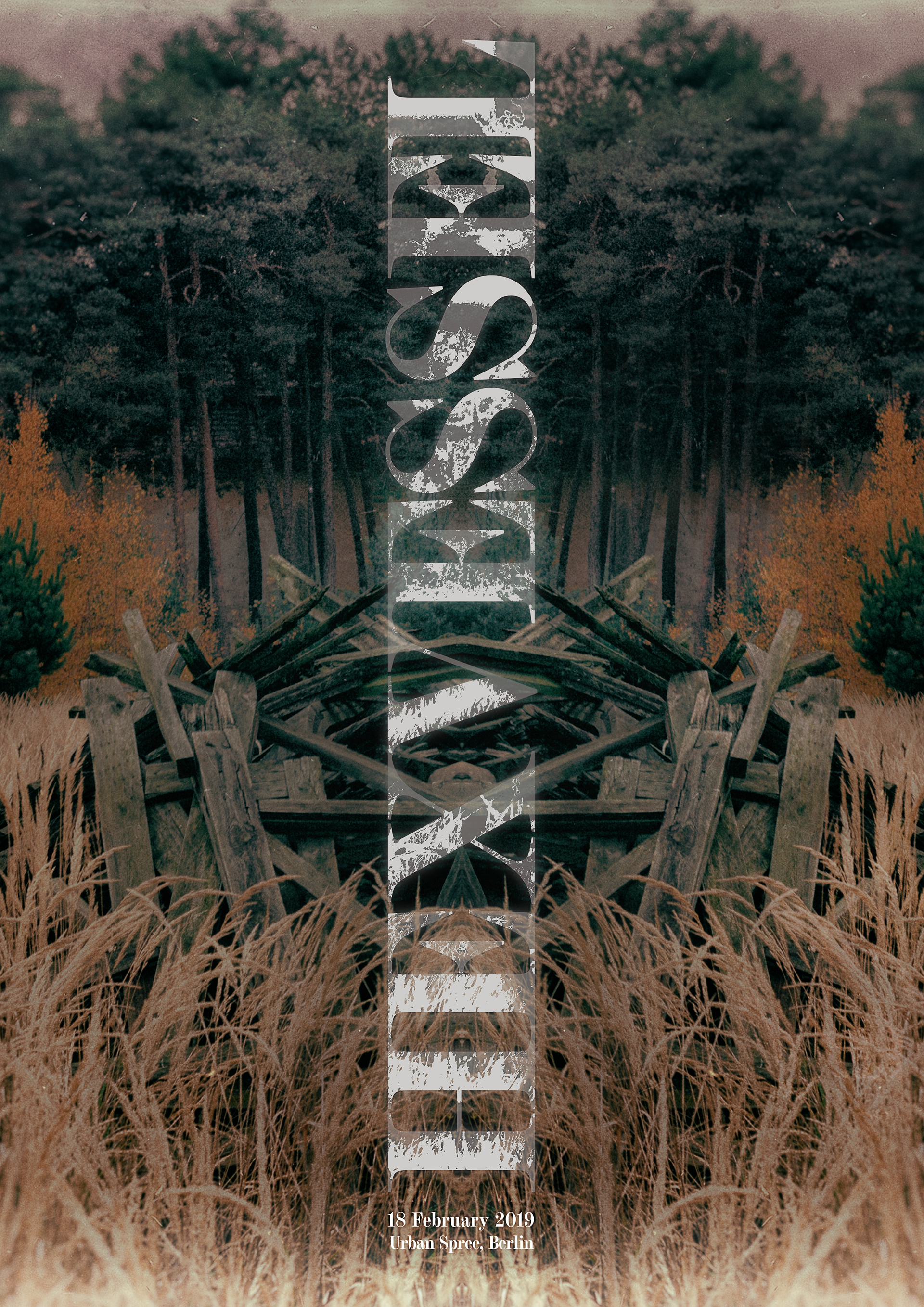
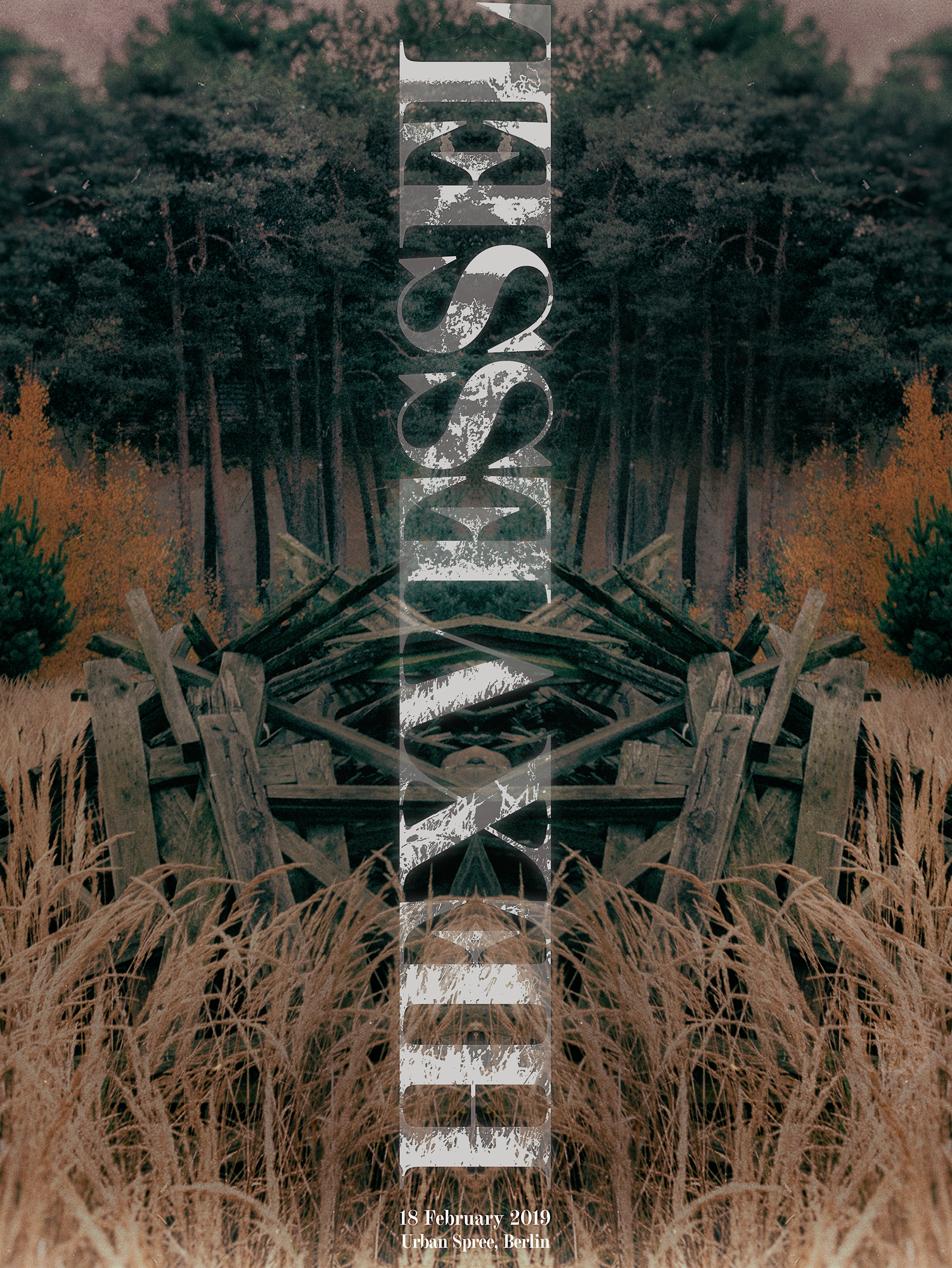
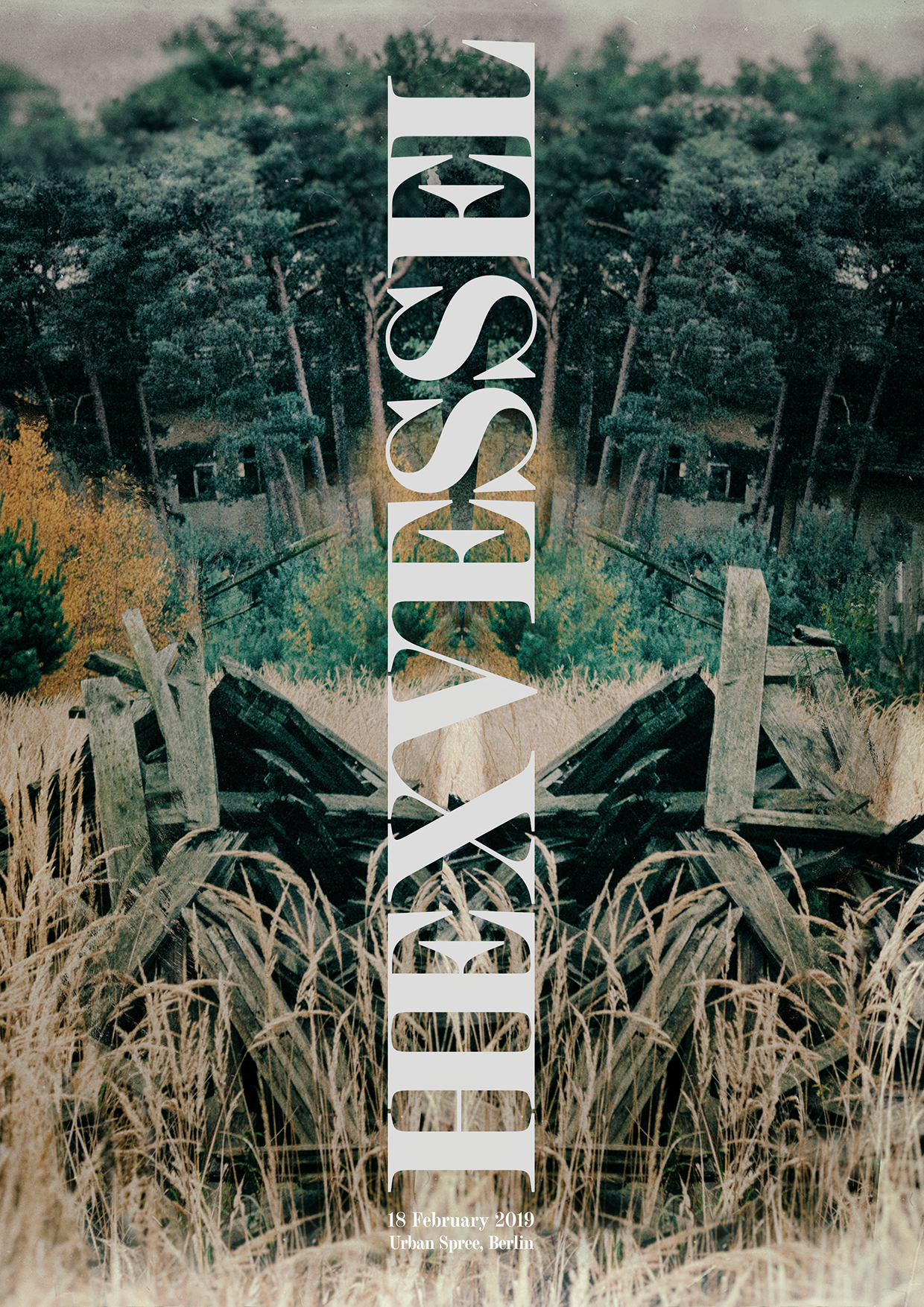
My idea was to come up with a photography based poster for a concert happening in February. The band is called Hexvessel and they play this pagan hippie rock music that, for me, sounds like the Doors on mushrooms. I love the band and I have seen them before so this is more like a tribute than a real poster.
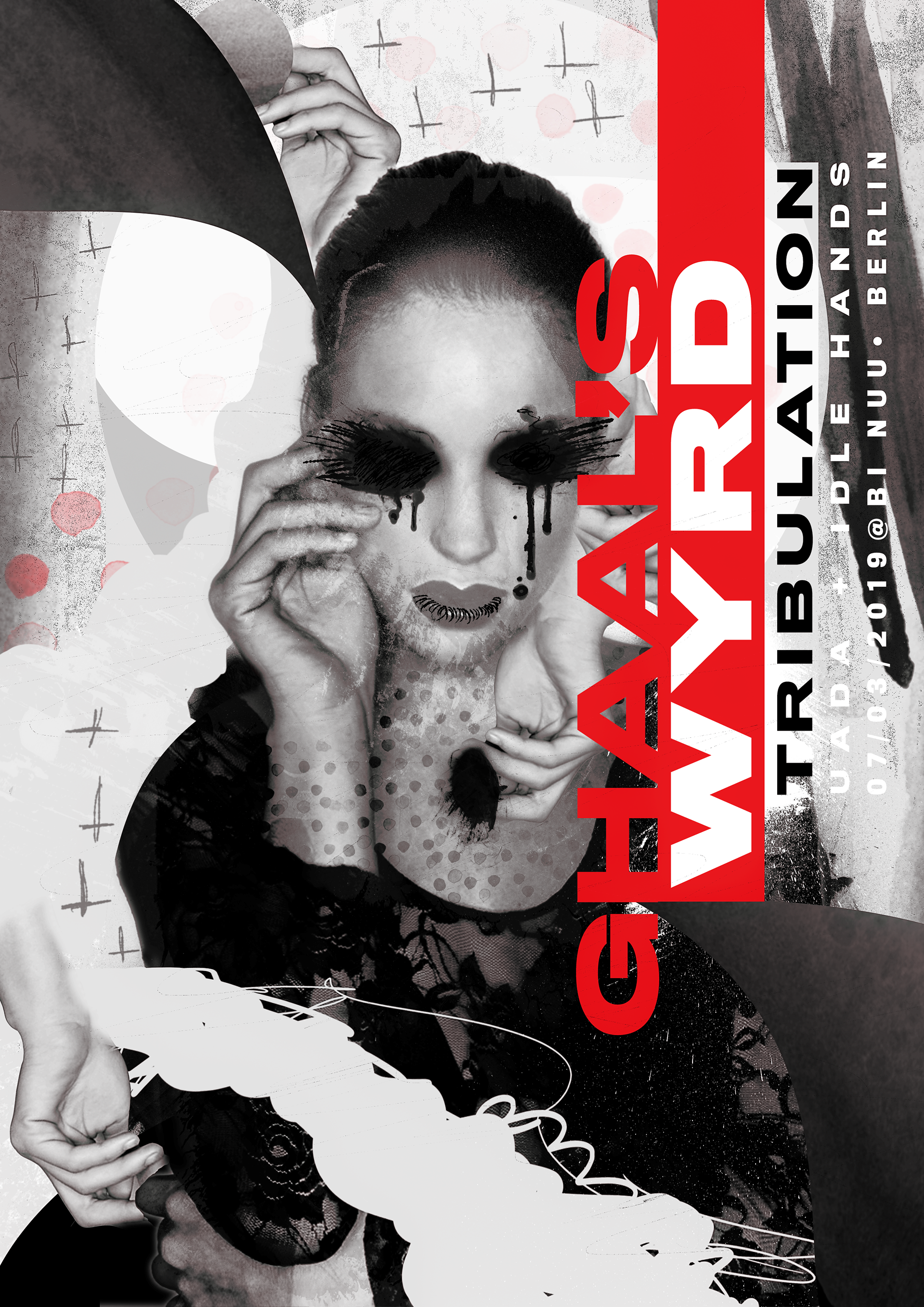
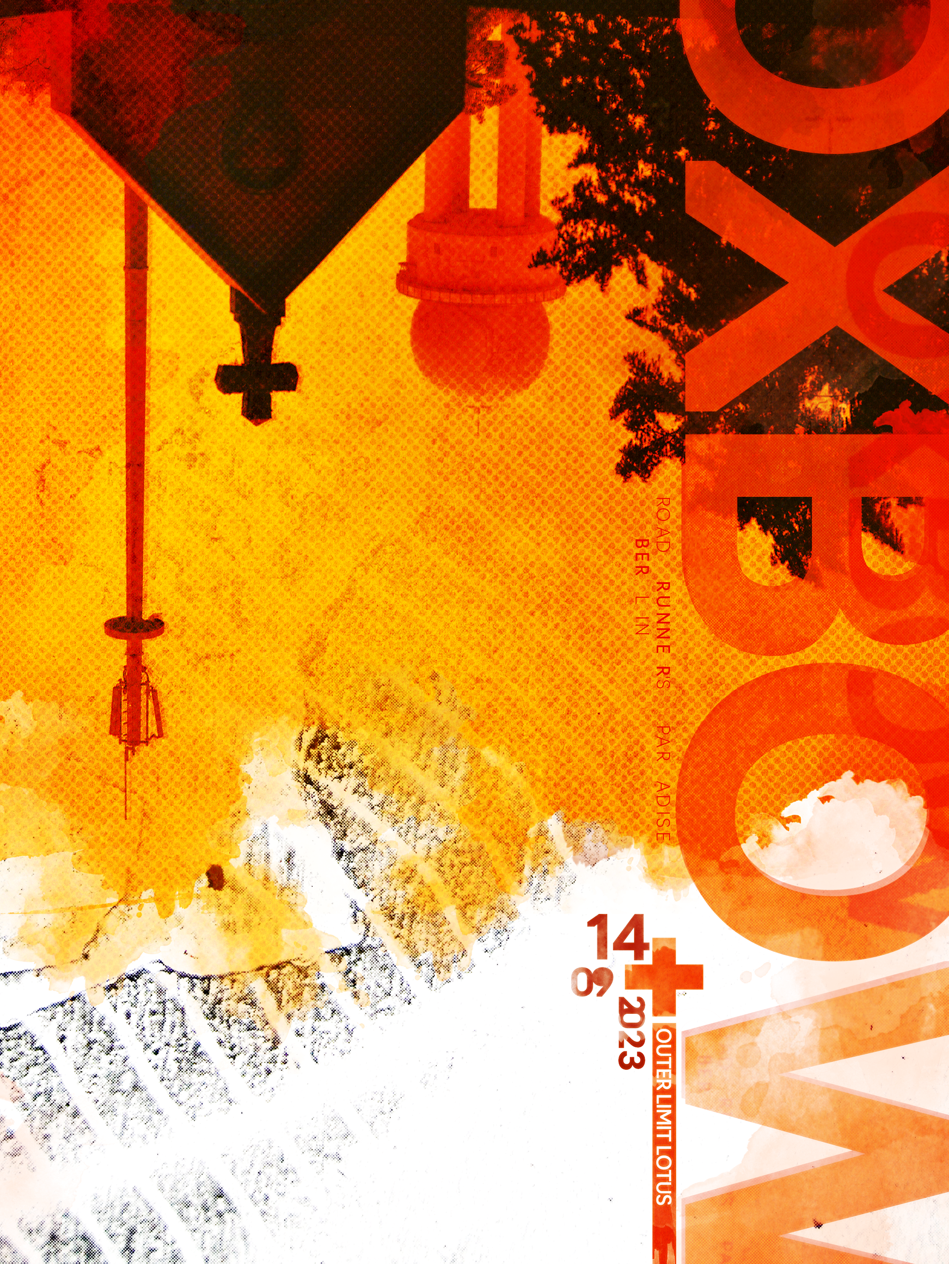
When it comes to visual style here, I wanted to challenge myself to design something a little different than what I'm used to. So I tried my luck with what I decided to call "digital collage" style. Something with a fashion approach that would be exactly the opposite of everything related to visual aesthetics of the bands playing.
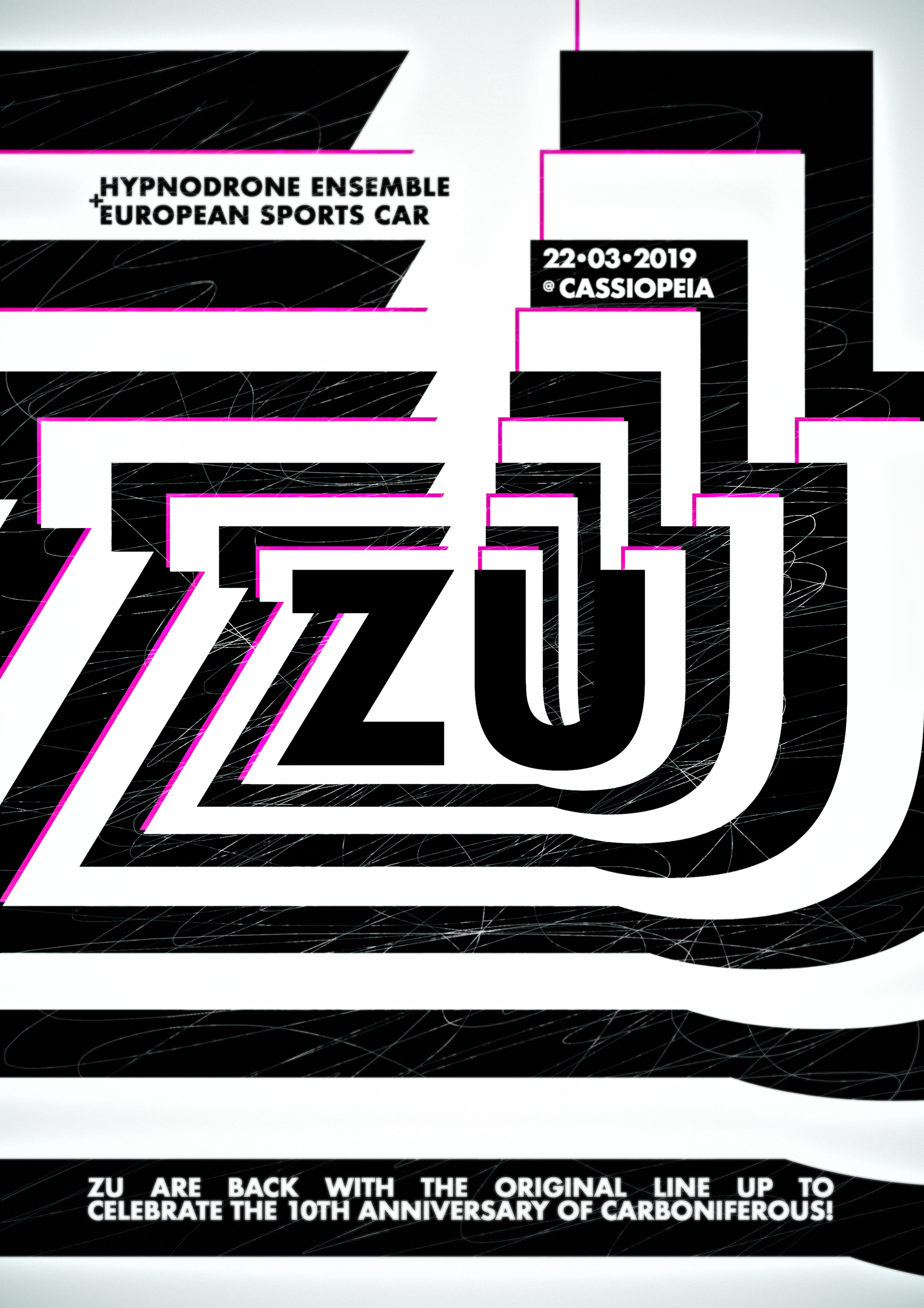
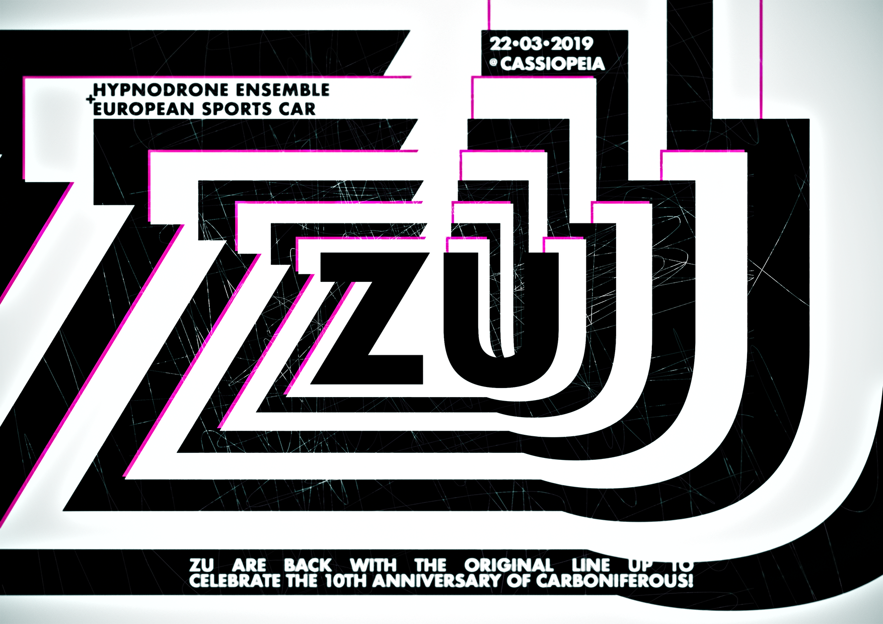
Zu is one of these bizarre bands that mix different styles and come up with something new and unusual. I first listened to them around ten years ago, the time when Carboniferous was released. And since this is one of my favorite "jazzy" albums of all time, I had to go to the concert and design something for it.
My challenge here was to come up with something a little different than my usual go-to style. This time, I went with this geometrical style with a focus on the name ZU.
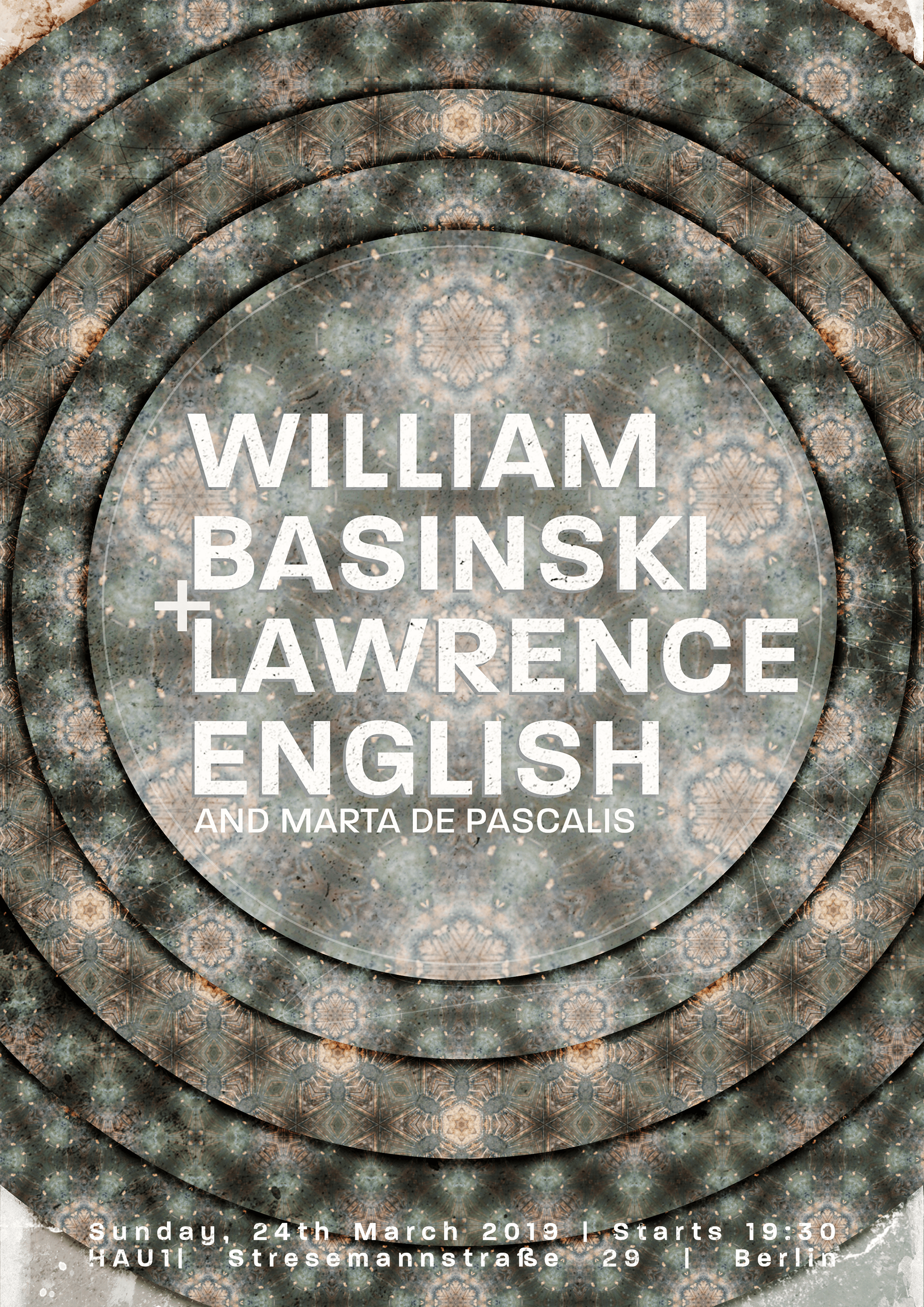
For this poster, I tried to do something related to the album that William Basinski & Lawrence English released together: Selva Oscura. My concept here was to use visual patterns to show different layers of this dark jungle that their music is leading me into.
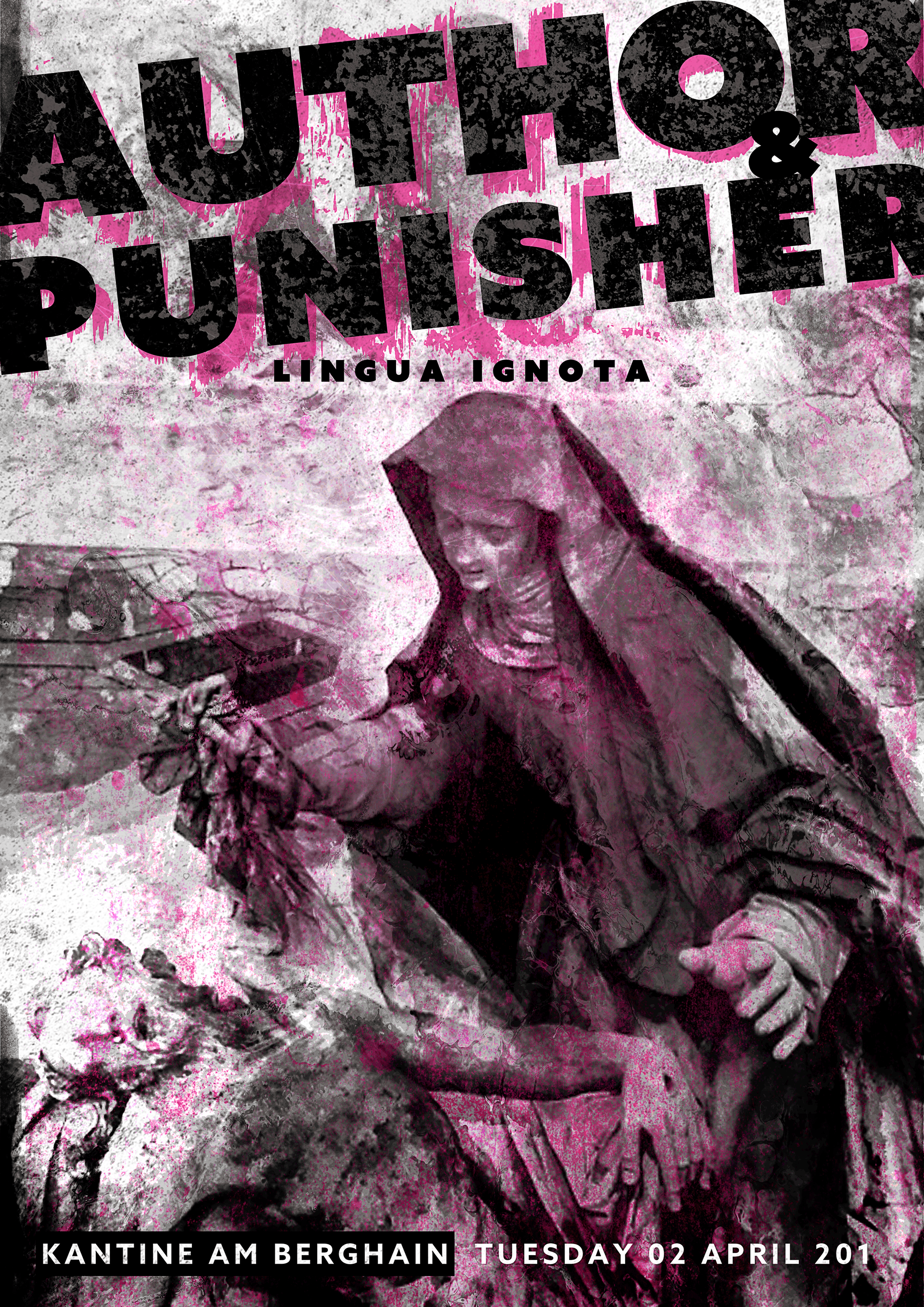
The concept for this poster came to me after visiting a church in Milano, Italy, that had a gorgeous religious statue. Since this image got stuck in my head for a few days, I decided to use it as the main element on this poster.

I went through some pictures I took during a vacation in Ukraine and found an interesting poster to be used as a reference. Then I redesigned this fire hazard poster on Photoshop and made it my own, somehow. Designing poster based on “vintage designs” might be something to explore a little bit further since I like the colors, style and composition from the era of this poster.

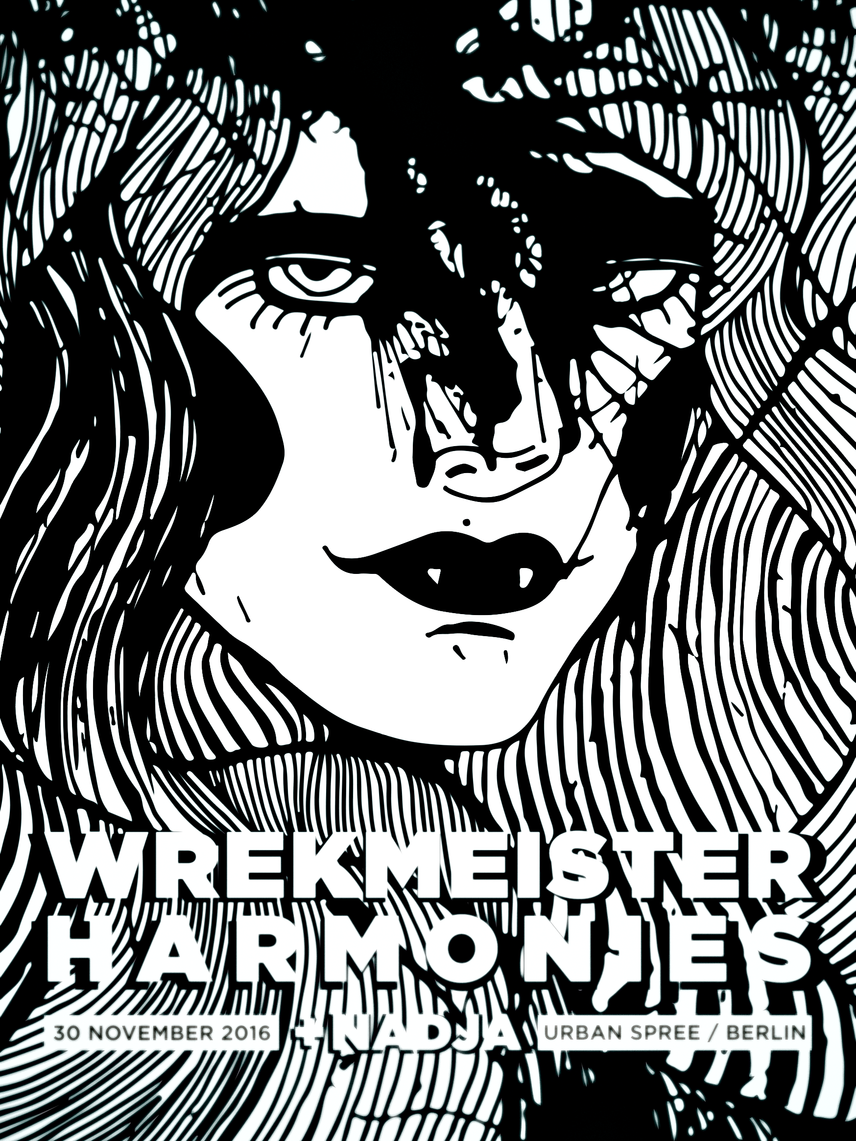
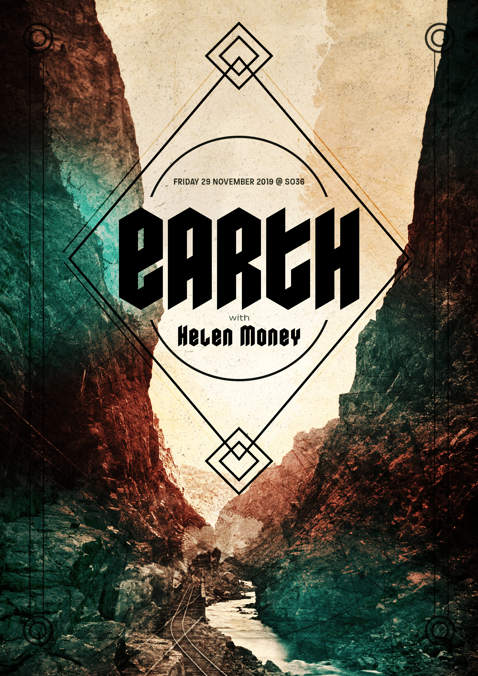
Big Brave is an exciting new band. Somewhere between the margins of a minimal rock band, experimental outfit and drone aficionados, Big Brave explores the possibilities of always resisting and deconstructing the archetypal characterizations of song structure and form.
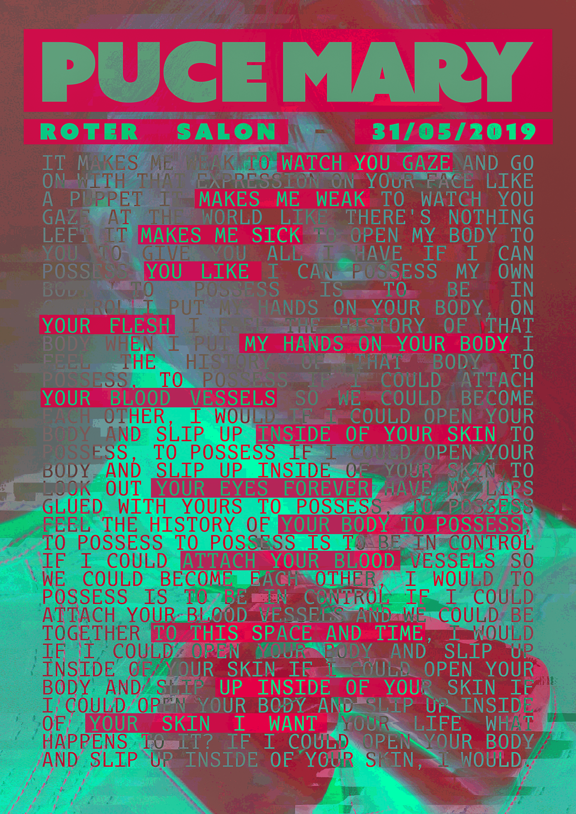
My goal for this poster was to go in a different direction from the poster I did for the previous concerts I went to. Instead of illustrations or photography, my goal was to work on the text. Only text. I chose the lyrics from one of my favorite songs and decided to use it as a central element in the poster.
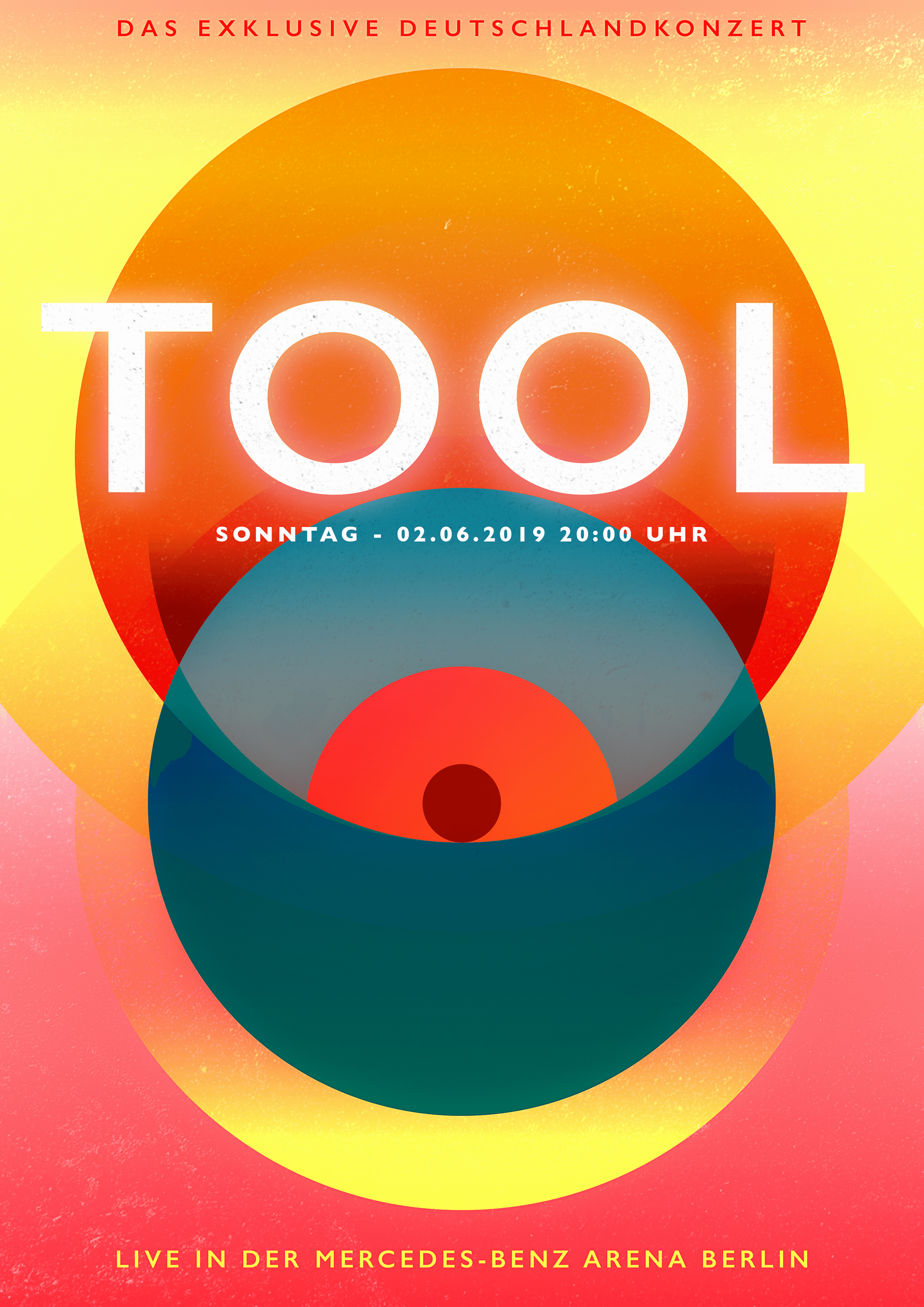
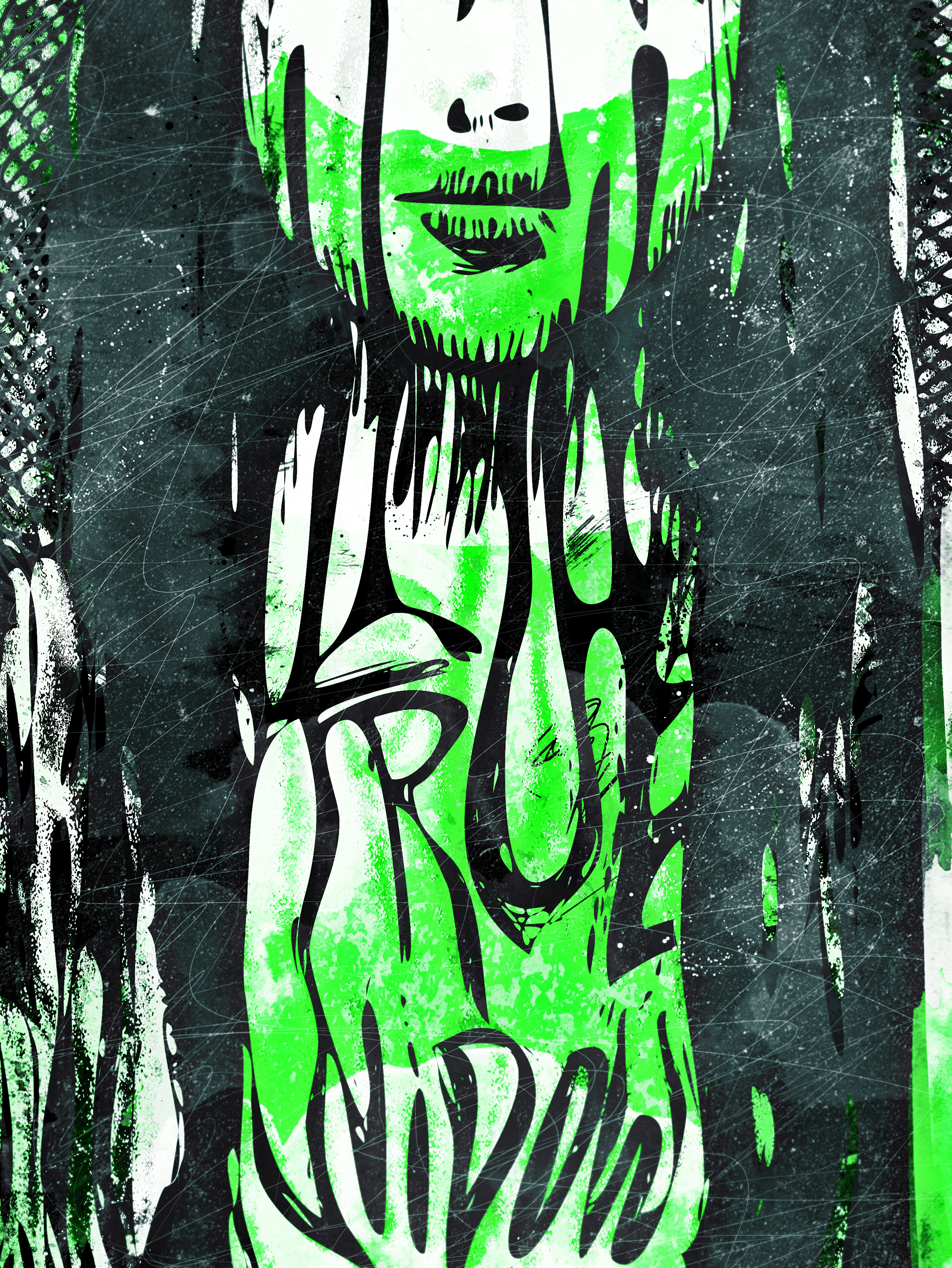
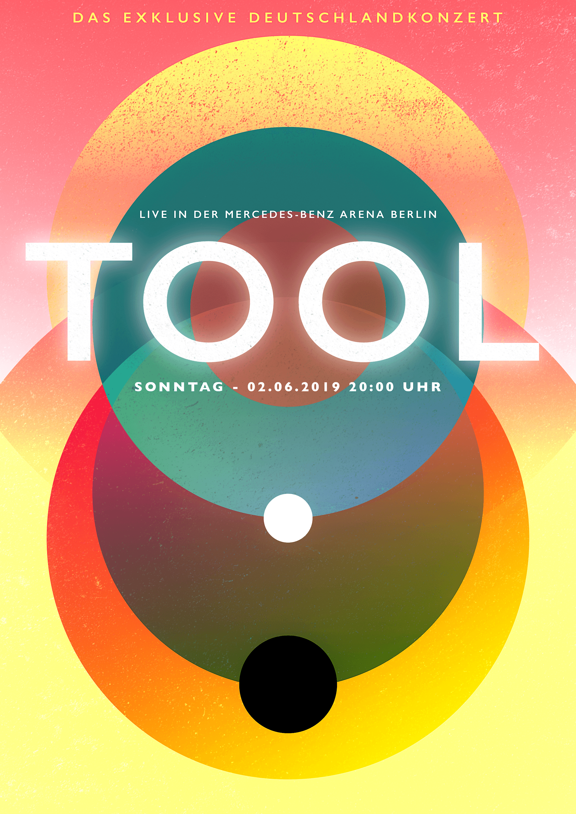
For this poster, I wanted to keep away from the visual cliches that surround Tool. I didn't want to use anything similar to what their album artwork looks like or what they have as merchandise and video clips. Since I was going for something different, I decided to go a bit further and challenge myself with something out of my comfort zone as well.
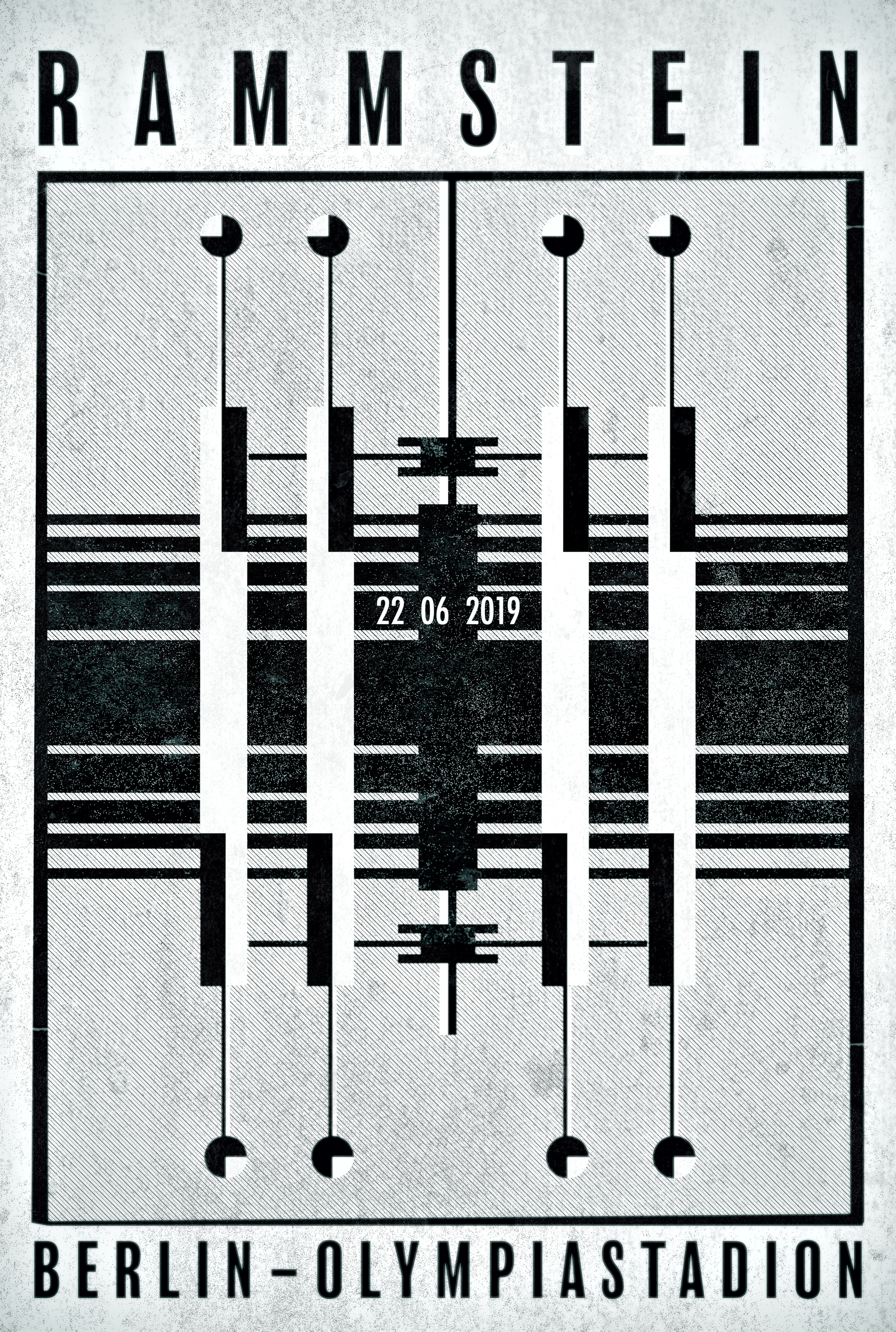
I decided to spend some time designing some more straightforward and in vector form. This is why I went from something more retrofuturistic based on some lights I saw at the Bauhaus museum a couple of years ago.
First, some vectors and shapes. Second, some brushes and dirty to make it look less digital. Then, some colors just to see if it makes any sense.

When it comes to the poster, I decided to play around with a concept that I used before - Pere Ubu in 2015 - with two faces in the same drawing. This time, I picked up some of the sketches I did for 2015 and decided to turn the face into something more menacing, and this is where the poster started to shape up in my head.
In the end, with the same illustration, you have two different sets of posters that can be hanged in any position.
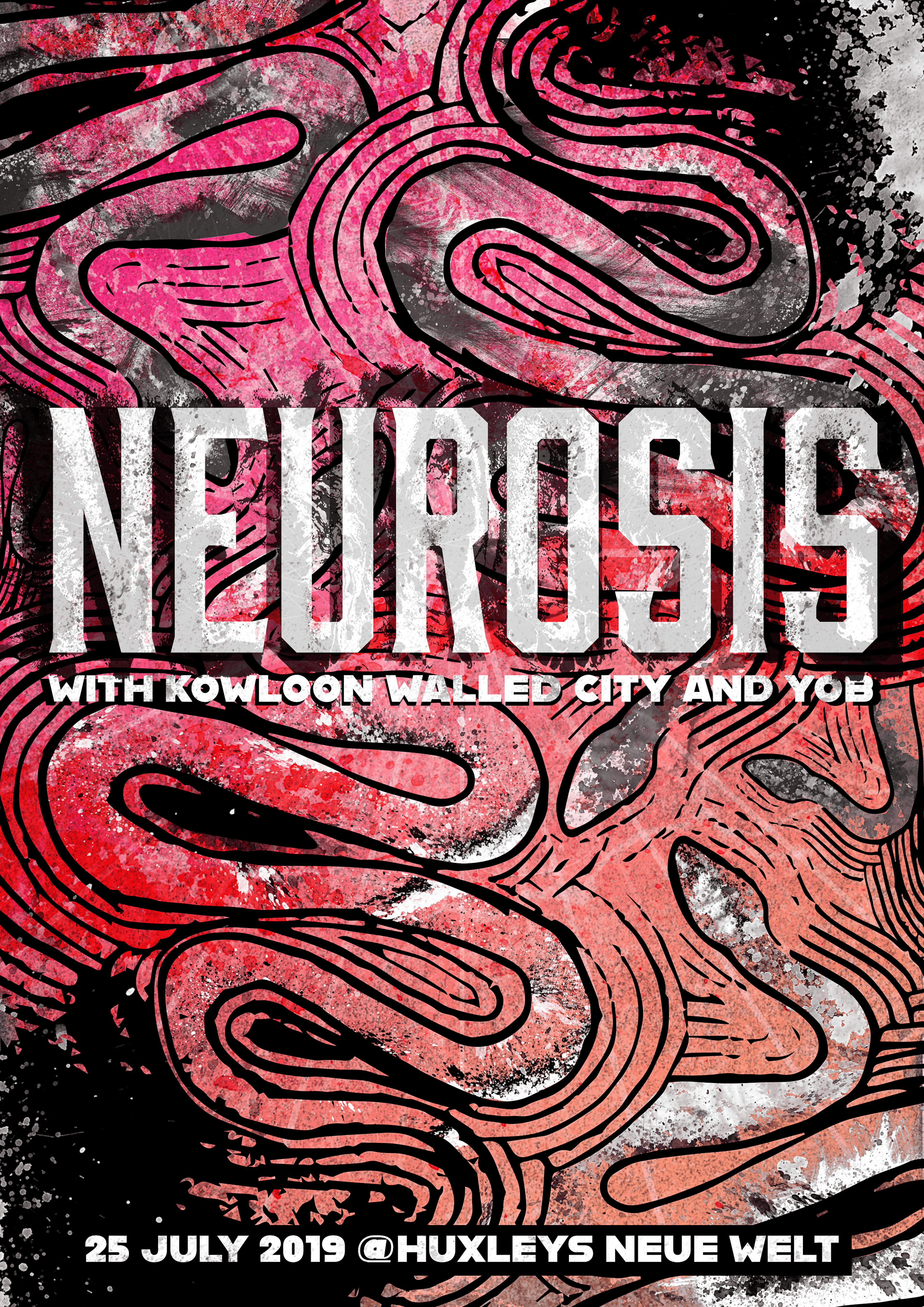
My first idea was to use some of the elements on the cover of the album and try out something simple with this element. I tried to draw the mask in the background but I didn't like how it looked like so I went with the snakes.
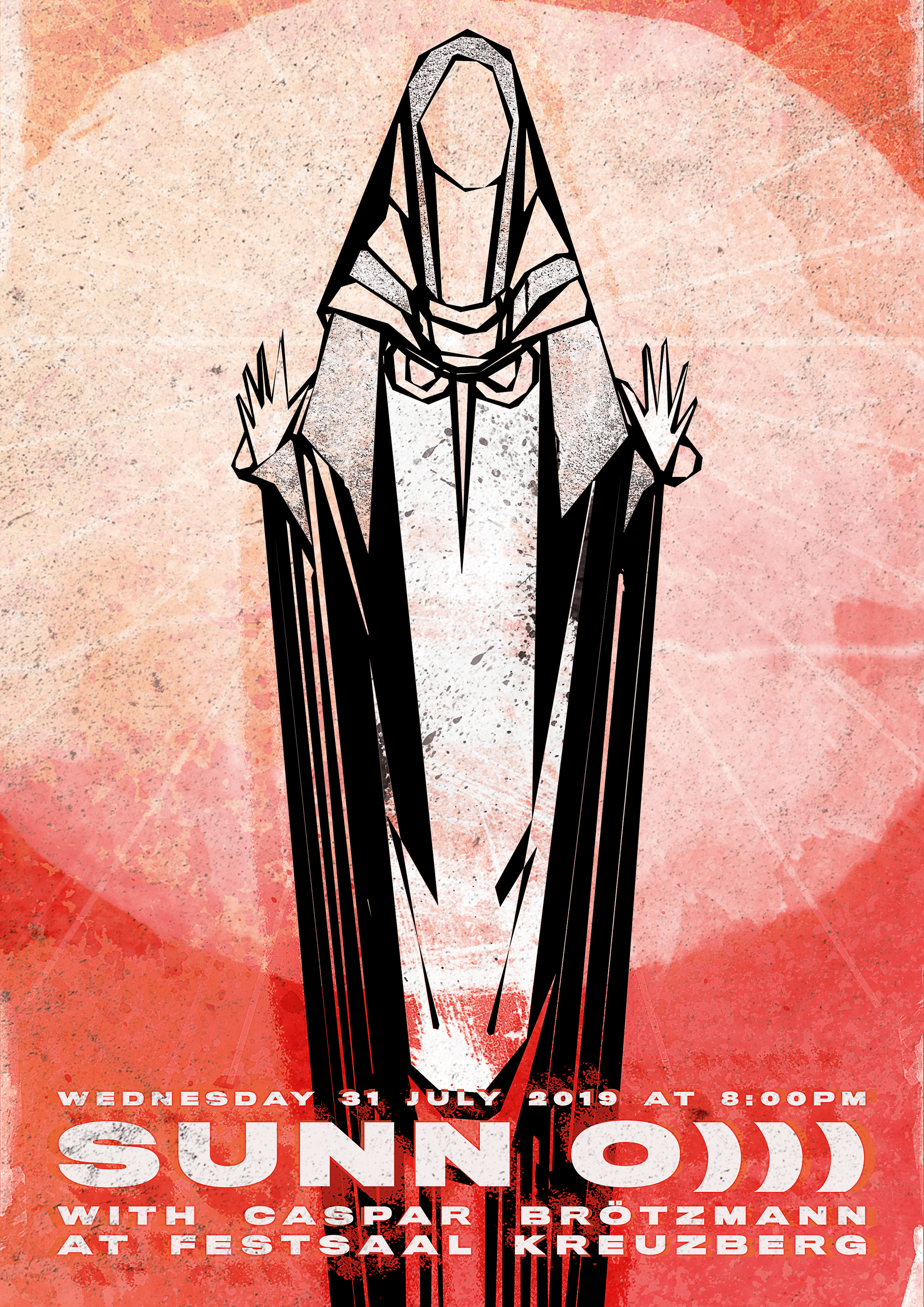
I had some drawings laying around my house, and I decided to use one of them of the upcoming concert with Sunn O))) and Caspar Brötzmann at Festsaal Kreuzberg.
The drawing I did had this religious aspect to it, and I believe it makes sense when it comes to the sound and atmosphere of Sunn O))) so I decided to go with that look.
My first try didn't work at all, and it cost me some weeks of frustration but, in early April 2020, I started sketching some faces, and I felt like this could be the way to go with
the poster.
Since I wanted to experiment with the aesthetics, I tried a different color palette as well as a different set of textures. And, even the typography was arranged differently.
The starting point for the poster was a set of pictures I found in a museum, and I sketched over some of the elements I found interesting and started composing something similar to what I had in mind. The process was more time consuming than I was expecting, and I ended up not enjoying the final product that much.
But this was back in August 2019, and, a couple of months later, I decided to review the images and changed some things.
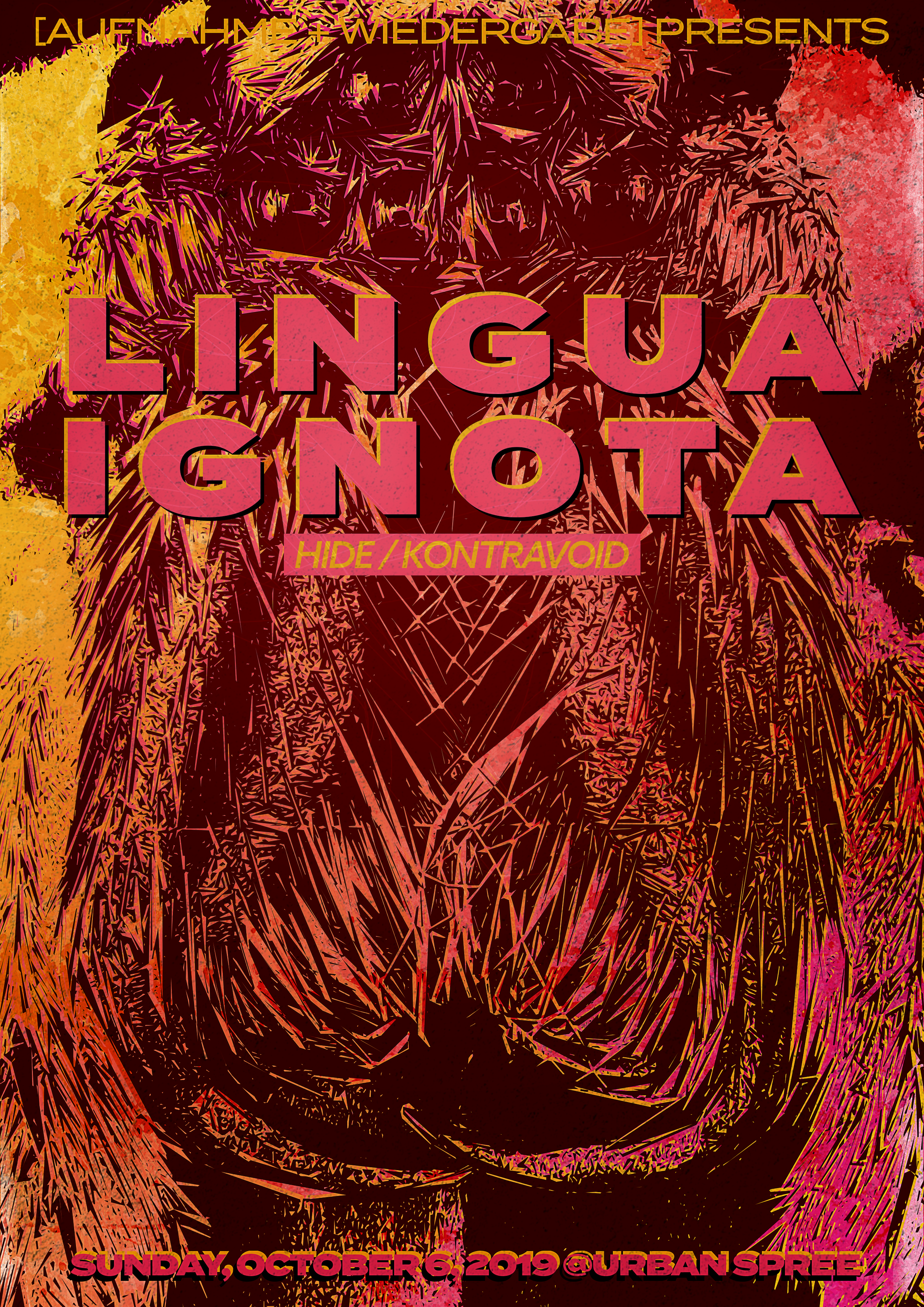
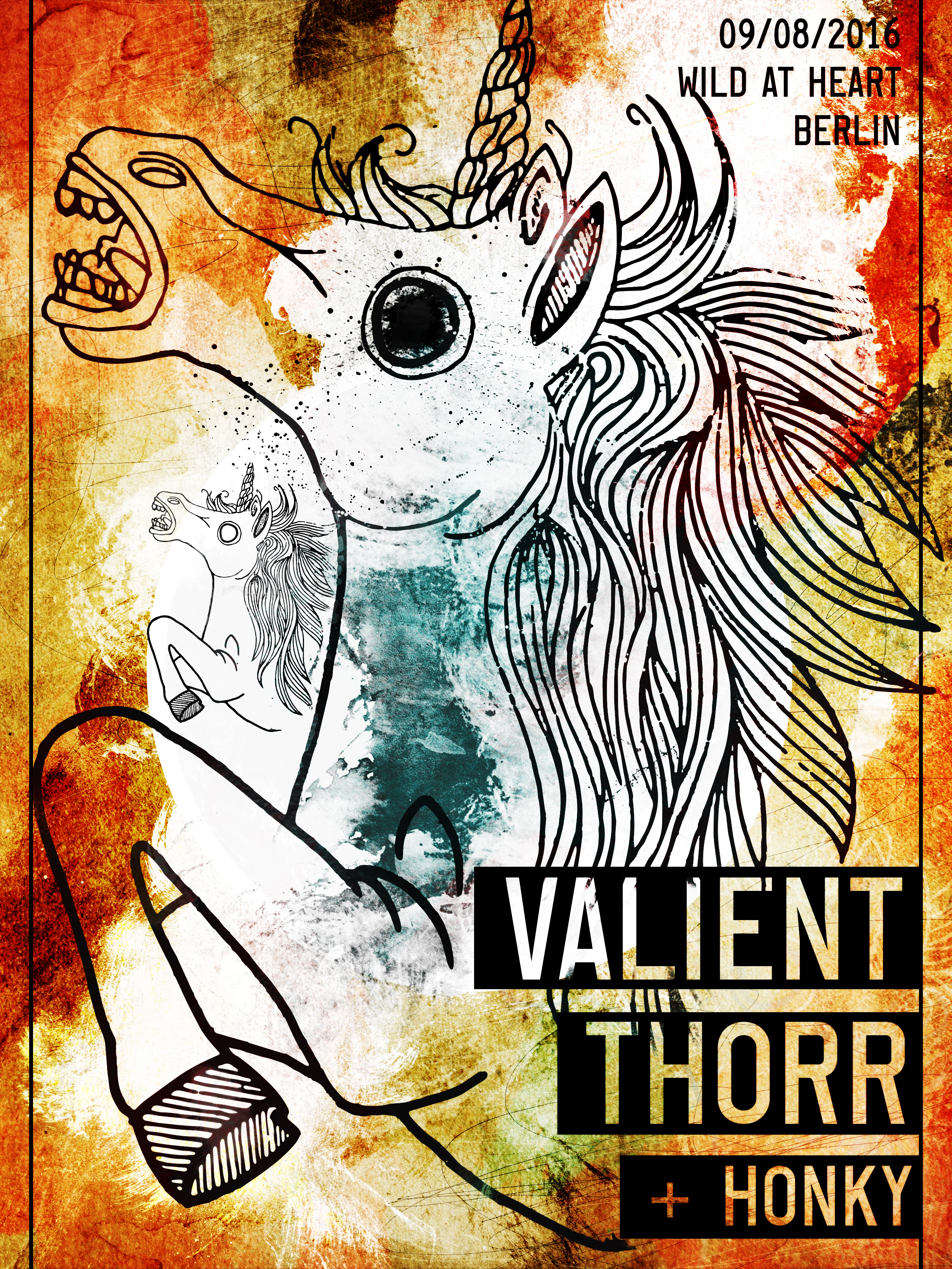
I had seen a spider picture a couple of months ago and, since I saved it, I thought about using this one on the poster. First, my idea was to draw over the photography and create something different, but, after spending a couple of hours drawing the hair on the spider, I realized that this would be too much.
So, I decided to try Adobe Capture for vector images, and this is how I restarted the process one last time.
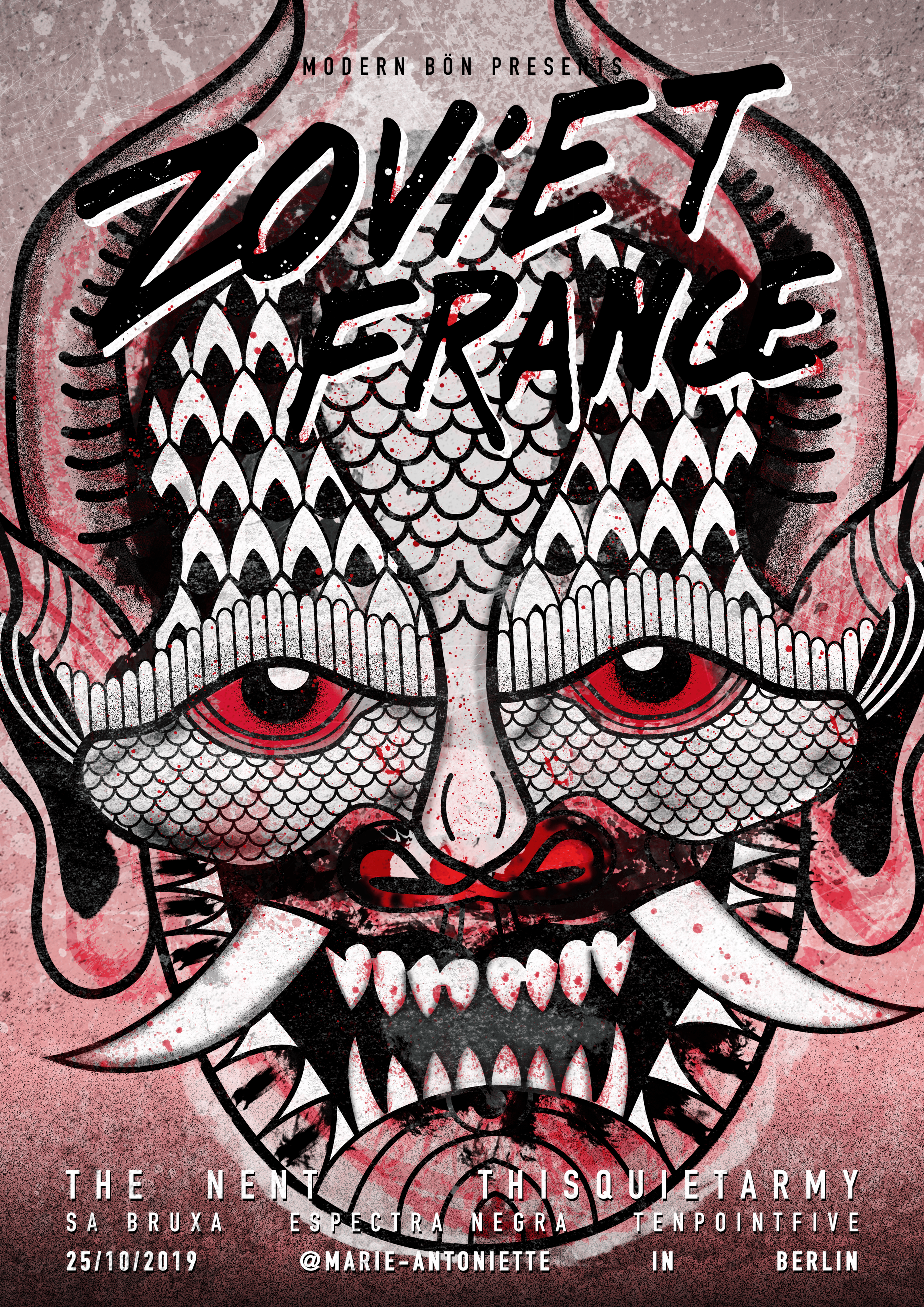
The idea here came after I saw a Javanese style mask on a photography book, and I thought it could be something interesting to use for Zoviet France since some of their songs give me a similar feeling as the mask.
With this in mind, I did a few drawings of the mask and some letterings with the name Zoviet France as you see below.
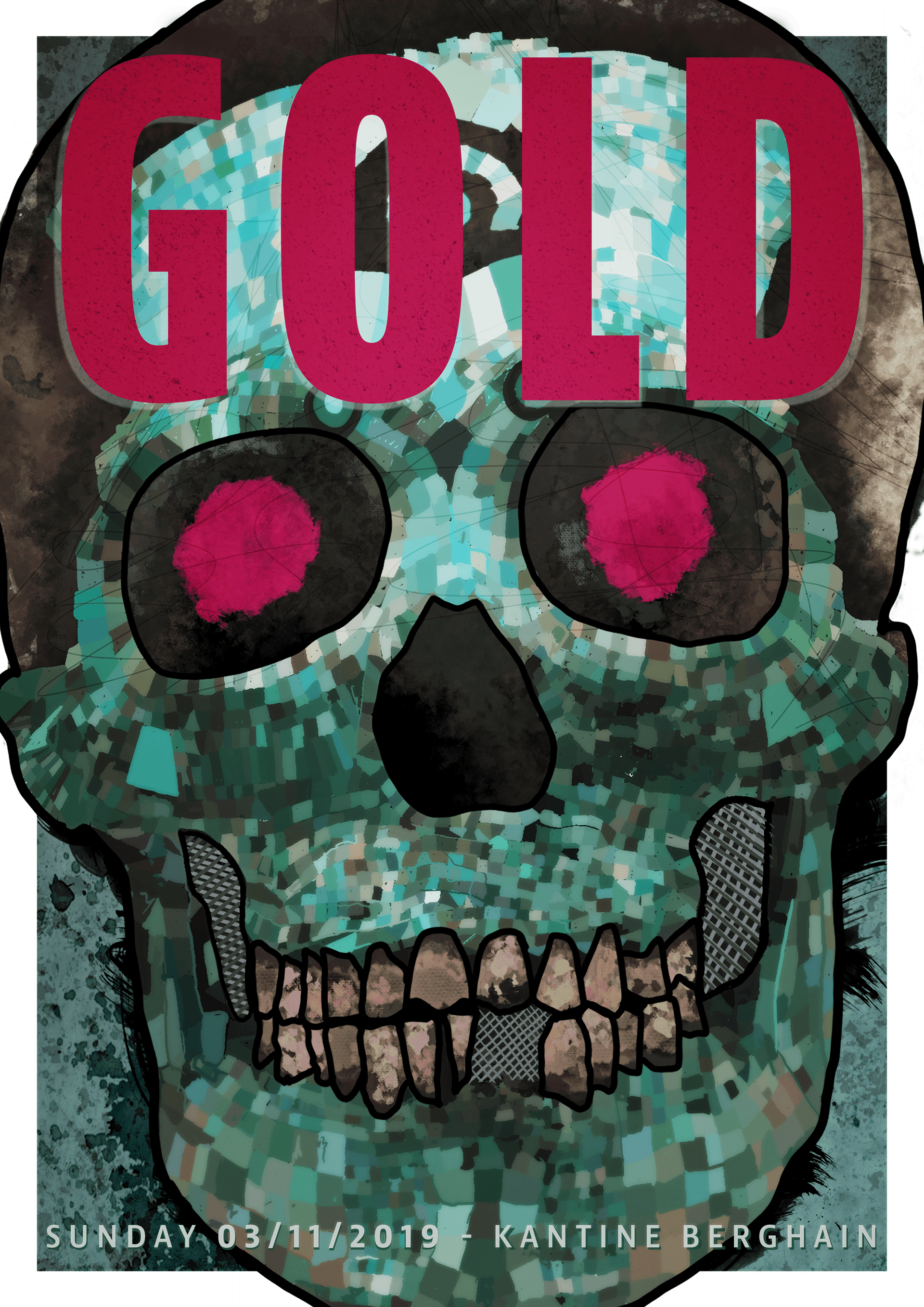
I thought it would be an excellent opportunity to see how I could use my iPad pro for illustrations and the skull mask you can see was done languidly using Procreate since it was my first time doing something like that as you can see in the short timelapse at the end of this project.
I'm happy with the results here, and I started using my iPad pro for illustrations more and more, and I'm glad for this project for showing me what can be done.

Mayhem I had seen Gaahls Wyrd earlier in 2019, but I didn’t want to miss them once I knew they were coming to Berlin to play with Mayhem in November 2019.
My idea was to try some more “heavy metal” and, with this in mind, I decided to look in my design archive for something that could be useful. I found a poster I did back in November 2006 with a skull and another one from March 2009 with some bird wings.
After the concert, I decided to explore some of the visual images that their music brought to my mind and do a poster with it. I had a folder with some old school North American exploration pictures that I wanted to use for something, and this was the chance for it.
I played around with some colorful textures and colors over it, and the result was exactly what I had in mind, and you see it better below.
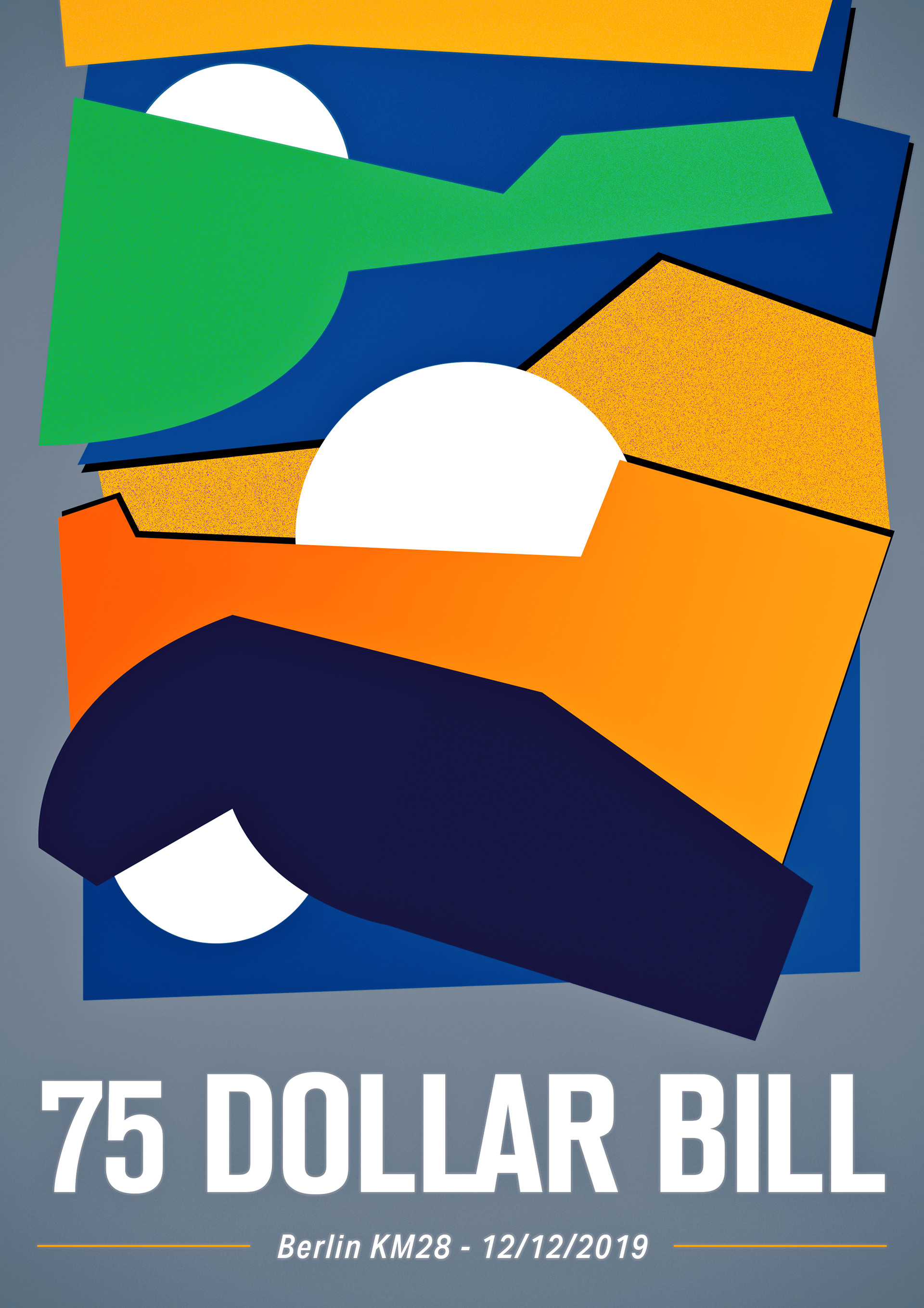
I wanted to create something abstract and reminiscent of a golden age of graphic design. My first sketches didn't go anywhere, but it all changed once I saw one image on Twitter.
I liked the colors used and the geometrical shapes, and I knew I wanted to have something similar on my poster, so I decided to copy it first, using Procreate on an iPad Pro. Later, bring the file to Photoshop and play around with shapes and gradient until I could call it my own.

For the last concert of 2019, I didn't know for sure what to do. But, one day, I was playing around with Procreate on my iPad pro and started sketching a weird looking skull. After a few minutes of exploring it, I decided to use this illustration as a base for the poster.
First, I sketched the skull as a black and white element, but I soon realized that it didn't work like that, and I would need some colors. With this in mind, I went with a safe combination of orange and blue to see how it looked, since it's one of my favorite color combos.


This is it and now I have to continue designing the poster for the shows I have been in 2020. Maybe, one day, they will be done.