All the Posters from the concerts I've been in 2016
When I moved to Berlin, back in 2012, I came up with a project to design a poster for every concert that I would go to. In the first year, things worked all really well but, due to a lack of time, I stopped doing those in 2015. I missed doing it but I didn't feel like doing them. It's a weird feeling to have but... it happens.
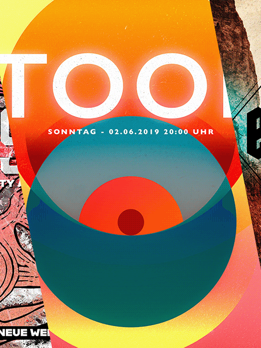
In July 2016, after watching Romano play a concert in Austria, I decided to do this again. All the concerts that I would go after that day, would have a poster designed by me. Those posters could be illustrated or something completely crazy. The idea was to do something for each concert and here you can take a look at all the posters I designed.
This one is from Romano and it's the reason I started doing these posters all over again. The visual is based on a scene from one of his videos and I played around some crazy vectors on it.
Ministry is one of my favorite bands ever and seeing them live was a dream come true. When I arrived home after the concert, I started drawing a wolf based on some of the imagery they had onstage and this is what I came up with.
This was my third time watching Valient Thorr and I just love them. The idea here was to play around with a unicorn visual for no real reason. I just like the concept and went with it.
Mastodon came to town in August 2016 and I did two posters for them. One had a pink and purple color palette and the other one was inspired by the colors on their album cover. I love them both and here you can see them.
The poster for Shining was a weird experiment. One day I was walking around my neighborhood and I found a box of old VHS tapes. I took a picture of it and it inspired me to do some visuals based on their design. This is why this poster looks like something you already saw before.
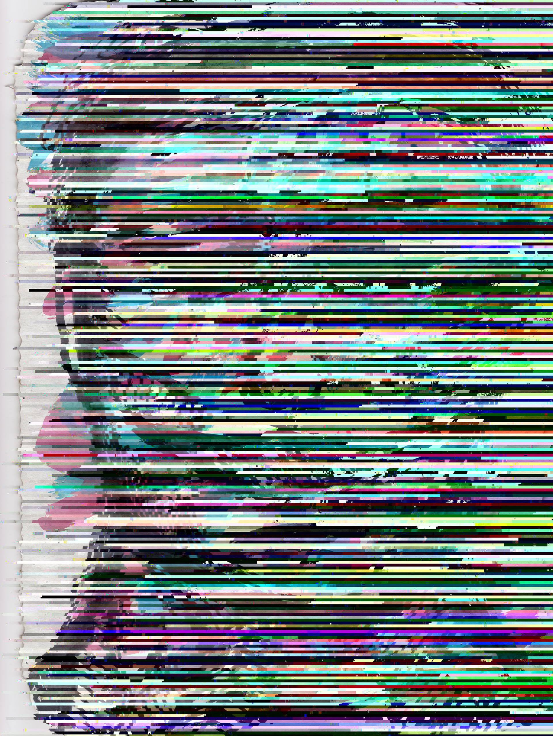
Death Grips is a crazy band. Their show is as crazy as their sound and I wanted to design something that would show how I feel when I listen to them. This is how I got into the mixture of glitch, vectors, and illustration.
Russian Circles and Helen Money played in Berlin in November 2016 and the poster idea came from an artwork I saw in a church. This is how I got into designing this hooded figure carrying a pierced heart.
Kvelertak always has something related to an owl whenever they play. Based on this idea, I came up with a drawing where a boy is wearing an owl's face over its head.
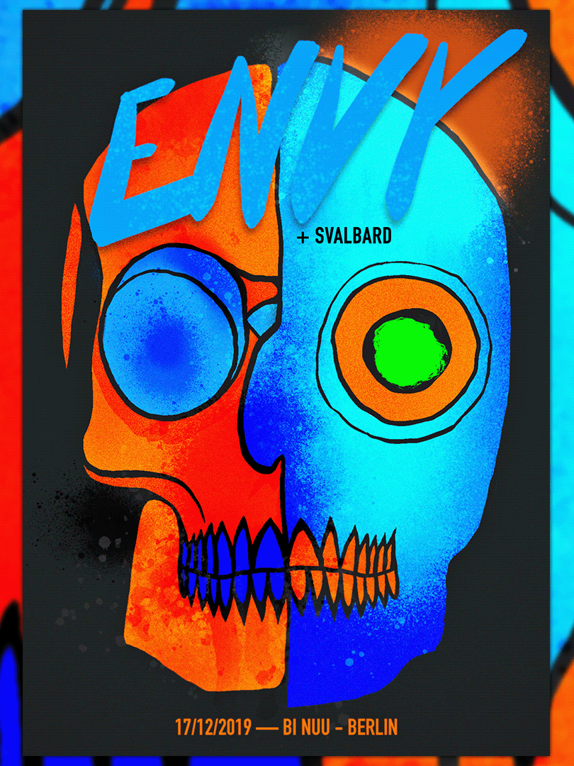
This is just a crazy skull drawing that I made by mistake. Maybe it reflects some of the crazy music that Meshuggah plays, maybe it was just a mistake. Who knows for sure?
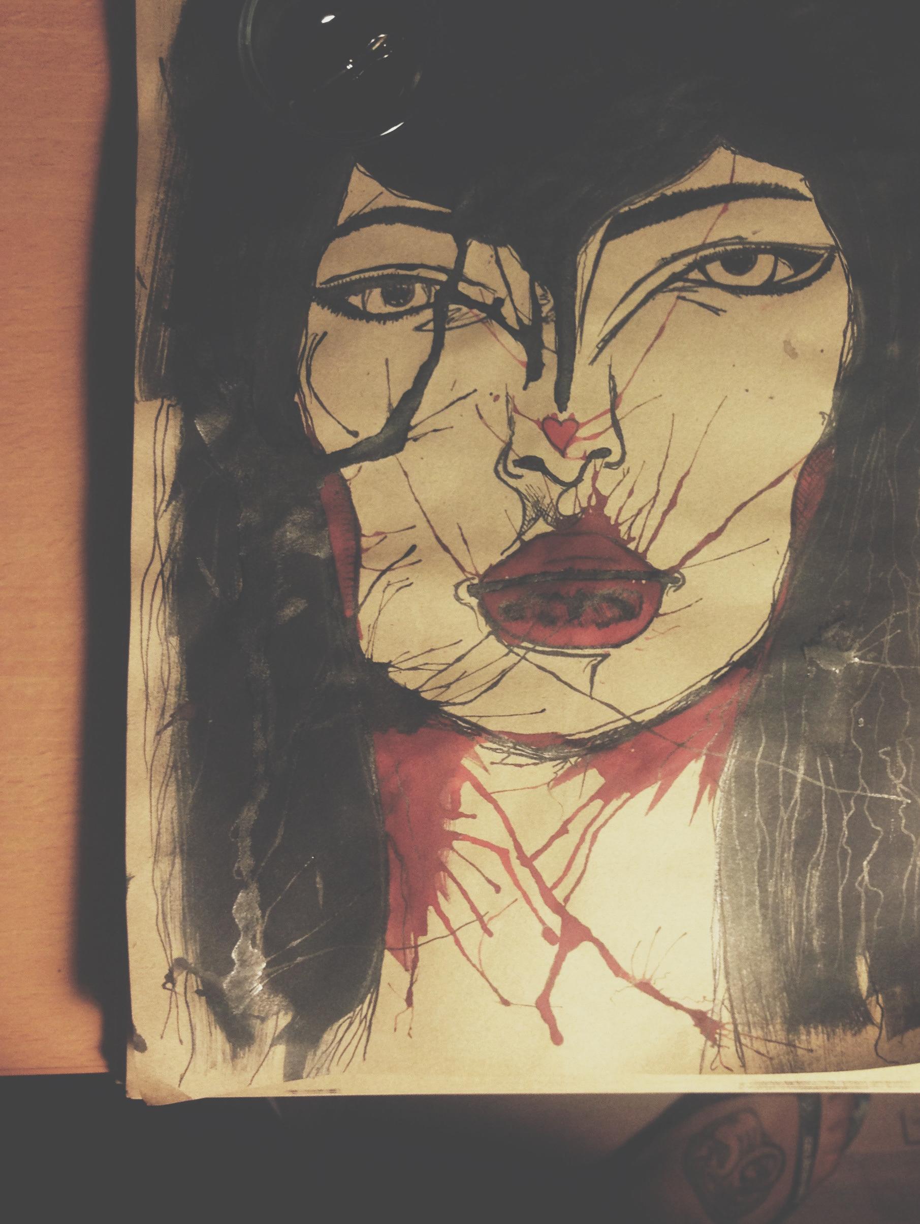
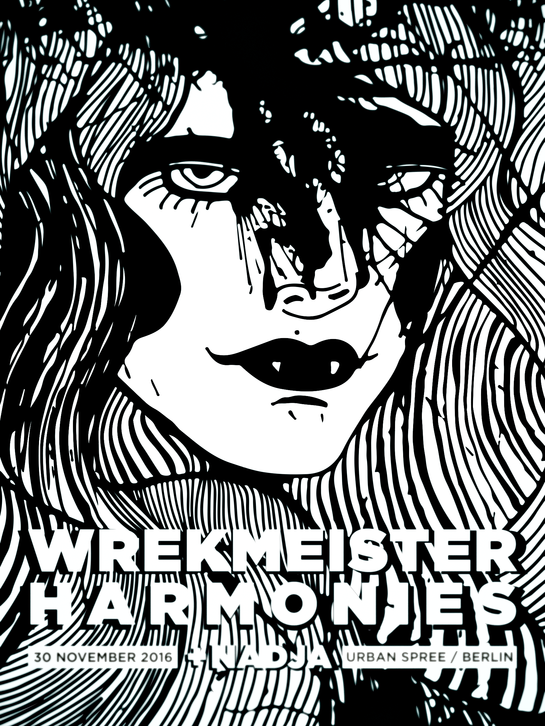
I don't have any idea where this vampire woman came from but it, somehow, matches the sound of Wrekmeister Harmonies. At least, for me.
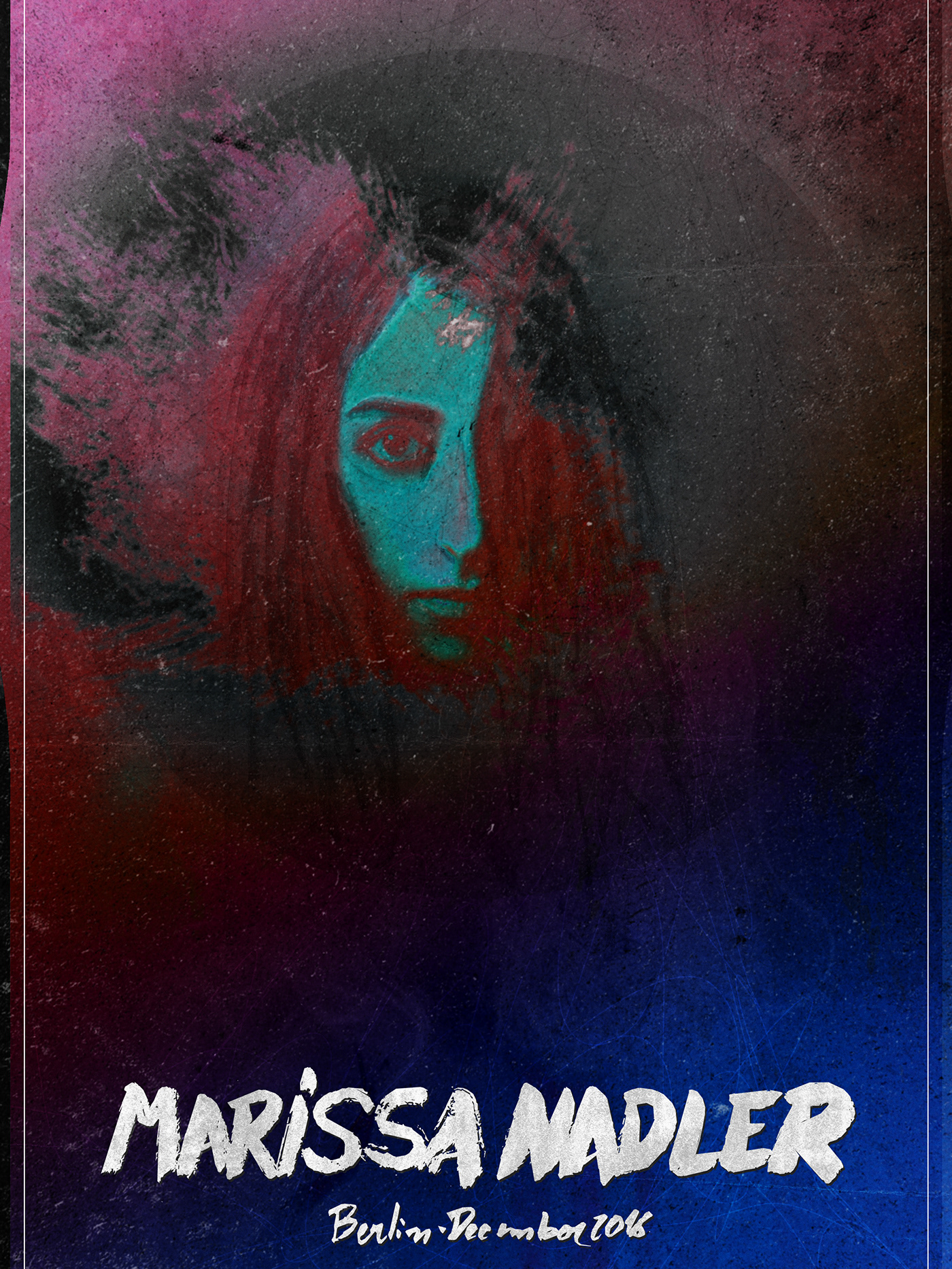
The last one if from Marissa Nadler, whose concert happened in Berlin in December 2016. My idea here was to play with something different from illustrations and this is how I got into playing around with her face. Below you can see the black and white version and above there is a colorful one
This is it and now I have to continue designing the poster for the shows I have been in 2017. Maybe, one day, they will be done.
